

What's the Point?
I am a terrible storyteller. Sorry.
I went to engineering school in the ‘90’s. My idea of communicating a narrative is ‘show your work’. This is less of an excuse and more of an explanation of how I think.
That said, I’ve gotten a few questions about this new shoe we’ve launched, the Point from Ninety Nine Products. So let’s dig in.
The Logo
The name Ninety Nine Products comes from the realization that 99% of the world has never touched any of the shoes I’ve had the pleasure of working on due to access, design or price. Our goal was to create product that began to reach a broader consumer than my previous work had done without sacrificing what made those projects successful. We may not get this right in year one or two, but that’s our target.


So the logo is a pattern of dots, 9+9, that look like the two hemispheres of the globe. This also represents my partnership with Scott Sun, another Nike alumni that supports our work in China.
The Upper
Not certain if this statement makes me more credible or less: I’ve spent more time studying runners and running shoes than actually running.
My introduction to running — aside from treadmills and high school basketball practice — came in the form of the Ekiden, the Japanese long-distance relay race run every New Years. This 219 kilometer trek from Tokyo to Hakone and back is one of the most celebrated athletic events in Japan. Naturally, Nike wanted to sponsor teams and runners, so we developed the Katana Series.
More times than I can remember our product team drove to one of the college campuses where our sponsored teams trained and studied their workouts, product preferences and training surfaces in order to improve the product. Their overall preference for lightweight, breathable, low-profile racing product has been influential for some of the best running shoes ever designed.
So I focused on evolving the designs of Steven Smith and Leo Chang to create the Katana Rac3r. And we got lucky.


About a year later I worked with the core Nike Bowerman team — primarily John Hlavacs, Stanislav Goussev (now with Adidas) and Andre Kriwet (now with Brooks). The shoe I cut my teeth on was the Zoom Structure Triax 11. While Hlavacs worked on the Men’s shoe, I worked on the Women’s shoe, using NSRL data to perfect the geometry necessary for gender specific fit and ride. While sneaker culture may recognize me for the Max+ 2009, you can see the influence of those sketch sessions with Hlavs in the Point.


At the time I didn’t appreciate the overt detailing, but I always respected the overall structure of support and containment that was crucial to those Japanese racing flats.
You can also find every best practice that I’ve picked up from every brand I’ve worked with from the lace hole positioning and 3/4 gusset to the Achilles heel and tongue soft pads.


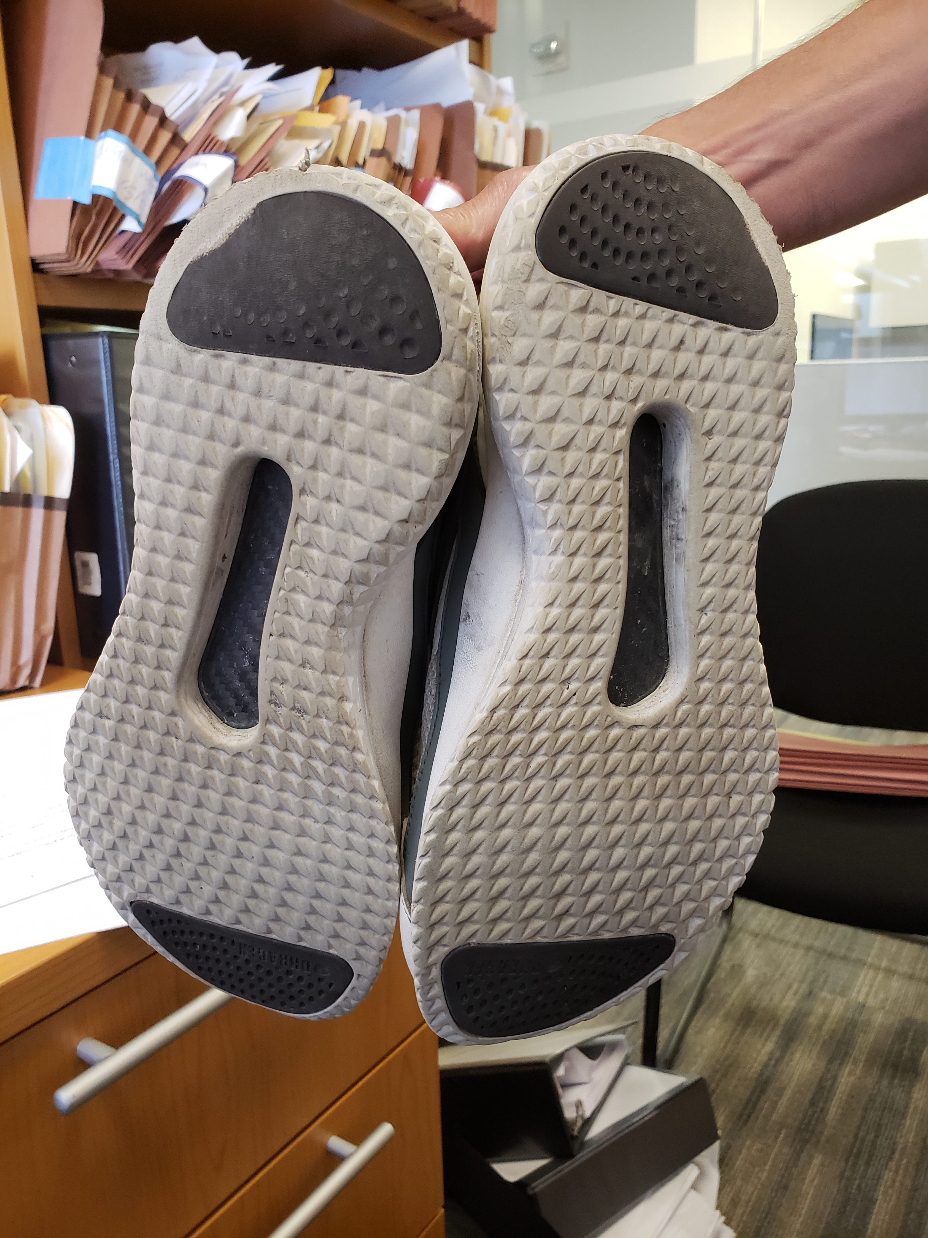
The Ride
With respect to the sole, the influence of the original Lunar Racer’s wide stance and heel/toe traction and durability have been influential in the LunarGrand, ZeroGrand and Yeezy 350 v1 and v2. The bulbous comfort visual and the functional traction and wear icons are timeless comfort food to the eyes and feet.
The carbon fiber plate is new.
Before I’d ever run in the 4% I played in the Jordan 11. The biomechanical principles that propel the wearer forward aren’t as likely as ads will have you to believe, but over distances the stiffness in the midfoot maintain the proper structure needed in your ligaments to prevent fatigue and potential plantar fasciitis. My goal was not to cut minutes off of your your marathon. My goal was to give everyone a shoe that keeps their feet from hurting.
And because I knew that folks would doubt that we would place a full-length carbon fiber plate in a shoe near $100, we exposed the plate so they could see it with their own eyes.


The Packaging
For most of my time in New York City I lived in a giant apartment building — the kind with East & West wings, multiple doormen and a package room the size of a small apartment. I loved brands that understood the value of having their package stand out in those rooms. Whether it was the tape or the print on the box, you knew where it came from.
Yet I also like the brands that could sneak in without you knowing: you know what’s in that box from Memphis, right?
But, more important to us was cost and waste.
Why would we put shoes in a box and then put that box in a box to ship?
My shipping and warehouse expert, John Robertson, took the ordinary drawer shoe box and designed it so we could flip it to ship it.

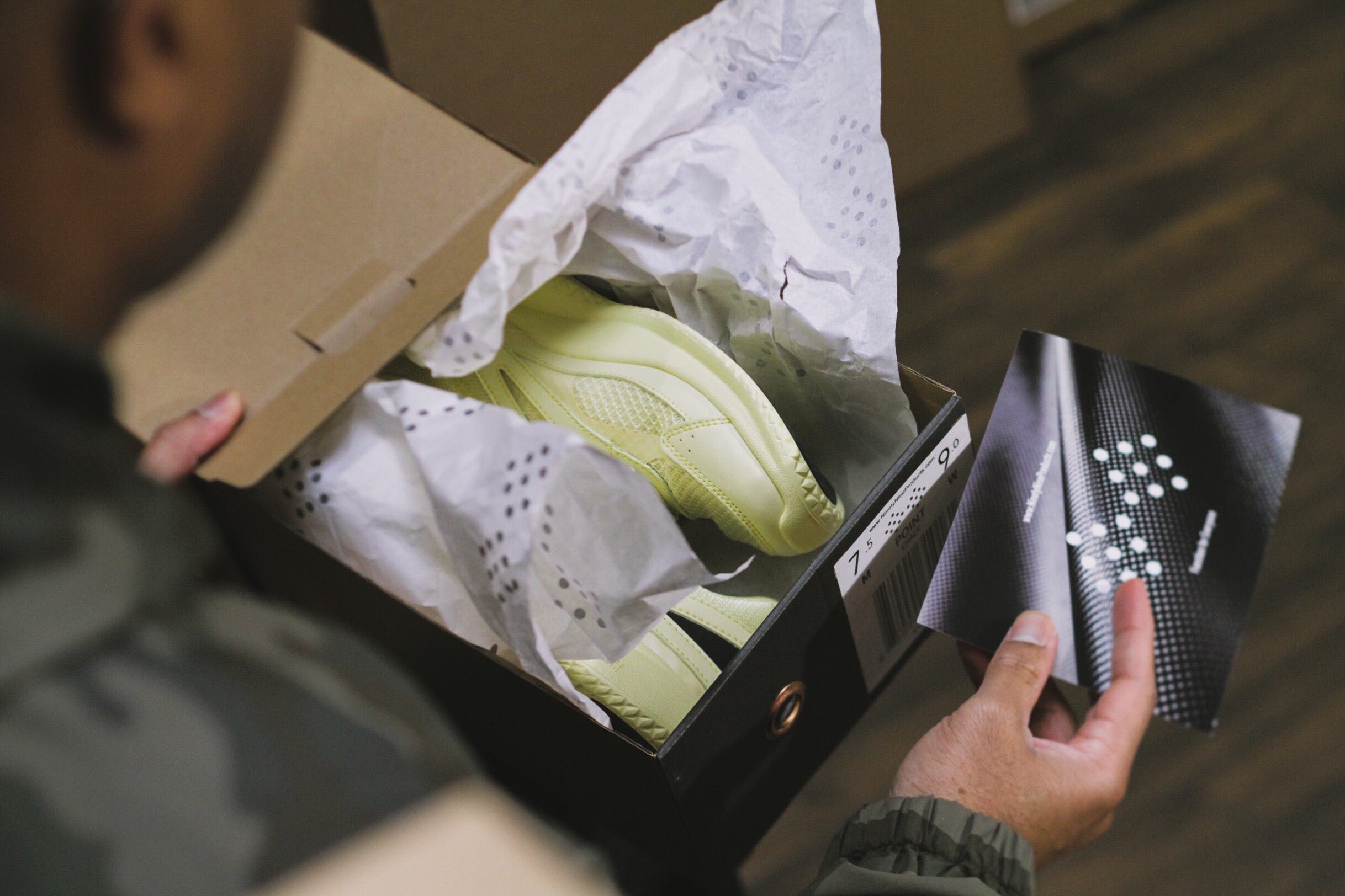
Yellow?
Yes. Yellow.
Last year one of our favorite people, material designer Lauren Devine, asked us to make some of our shoes in yellow.
On paper, nobody really liked the yellow, but we knew that pictures lie.
So we started with the shoe we were developing for seniors — JON for JEX|NYC.
Once we saw that our seniors — women and men — liked the yellow, we began sampling the Point in yellow, along with the other 7 colors we tried. Of the multiple colors we sampled, the only color that delivered the Love/Hate response was yellow. There were very few neutral opinions on yellow and once Scott began wearing them in Shanghai (he’s sample size) we knew we had the answer.
So we hope that clears up a few question with respect to the design of the Point. We hope runners like it for performance and nonrunners like it for show. More importantly, we hope people like it so we can continue to help people that help people.
Good things.
